Wednesday, May 12, 2010

DT 27.1 Portraits with Ryan

Some portraits in different lighting.


Thursday, April 15, 2010

AT 21.1

Last week we scanned some of color negative film. I scanned these in and did all the adjustments I would normally do in the darkroom, and also similar adjustments that I would do with my digital pictures. These all needed a fair bit of color correction, and also quite a bit of spot/dust removal. The contrast etc also needed to be adjusted.

My theme for this assignment was shallow DOF portraits. Some of these turned out nice, but a lot of them were out of focus, mostly due to the poor Auto focus on my film camera, and that I was shooting a lot of low light.


Aly

Aly


Ryan
From AT 24.1


Tristan


Monday, February 22, 2010

Prairieview Movie Week!

"Oh Brother, Where Art Thou"


"Oh Brother, Where Art Thou" was the first movie I watched during movie week. I remember watching bits and pieces of this movie over the years, but I don't think I ever sat down and watched the entire film from start to finish (or atleast not in a long time). I know it was written, directed, and produced by the Coen brothers, so I knew it would likely be a strange and very well made film. The Coen brothers are fantastic, and most if not all of their films are critical successes. Joel Coen's RT rating is a very respectable 85%, and his brother's RT rating is again a very respectable 81%, considering the way RT calculates it's ratings that is very impressive.

Now on to the film itself, it stars a fantastic cast that has great chemistry together. George Clooney, John Turtorro, and John Goodman to name a few, they are really fantastic actors. The character's in the film are quite well developed, although I think a bit more character development at the start of the film could have helped. You do get a feel for each of the characters as the movie goes on though. The story was interesting as well. It followed three escaped prisoners on their hunt for a so called treasure, which has them winding up in many funny and interesting scenarios. The film is a comedy, and it has the feel of a Coen brothers film, with the filmography, use of subtle humour, and the "look" in regards to the filmography. The filmography/photography of this film was really fantastic, something I probably would not have even noticed if I wasn't into photography. The special features section showed just how much work went into giving this film it's "look". It has a sort of "sepia" toned feel to it, as well as vibrant colors to give each scene a different look. The film really works well, as it combines photography techniques/color manipulation to give certain scenes an interesting "feel". The film was also viewed by the general public as a success, it grossed approx: $72,000,000 dollars which is close to three times it's $26,000,000 dollar budget, making it a modest box office success. It was also a relative critical success earning a 77% approval rating on RT and a 70% amongst the top critics. I would definitely say I enjoyed watching this film, I can appreciate it now more than I did before I started photography.
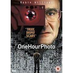


"One Hour Photo"

One Hour Photo was the second film I watched for our movie week, this was one that I was most excited about as I remember seeing it when it first came out, but forgot most of the important details in the film's storyline. I do remember Robin Williams playing as a lonely and very strange character who develops film for a supermarket. What really drew me to wanting watch this film is Robin William's acting, he is a very underrated actor, especially for dramatic roles like the one he plays in this film. As for the rest of the cast, they are all relatively unknown, mostly people who have played roles in television series, or minor roles in other films. The rest of the cast, however does a very good job with their respective roles, and they all contribute to creating what I would say overall is a very well done film.

The storyline is about a seriously lonely, and disturbed man played by Robin Williams. His character works at a photo finishing area inside of a local supercenter. He takes his job very seriously, almost too seriously for a man working in a one hour photo finishing center. He lives alone, and is insisted throughout the film that he has lived alone the majority of his life. He plays this character very well, and is really convincing in his portrayal of "Sye the photo guy". He develops film for families and watches as they grow up. He has one family in specific that he especially wishes he could be a part of, he often envisions being a part of their family, in a very creepy way. He seems to print a copy of every photo that he develops and keeps them for himself, and has an entire wall dedicated towards other people's family photos, this ultimately leads to him getting fired from his job; when things really start to heat up.

The films cinematic qualities are definitely interesting, they used interesting light and color balance for different scenes to incorporate different feelings during certain scenes. The lenses used work well witht the different parts of the film, they approprately incorporate wide angle lenses and telephoto leneses during different scenes. As with most movies the photography/cinemotography was great, and worked well with the movie.

My own personal opinion on this film, well let me say I really enjoyed it. Robin Williams really does a great job of playing his character, which seems like it would be among the toughest roles to play, especially for someone who usually does comedic films. The supporting actors do their jobs well, but they aren't really on the same level as Robin Williams. The film was a modest financial and critical success as well, gathering a 81% approval rating on RT, and grossing over $52,000,000 at the box office, far more than it's $12,000,000 budget. I highly reccomend watching this film, especially for the amazing performance by Williams.


"Manufactured Landscapes"

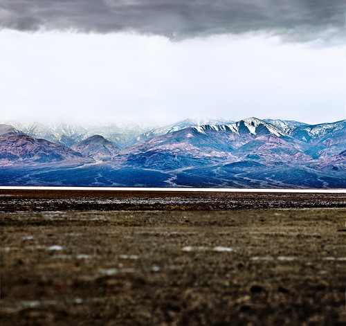
This was the last film of the week that I watched. I chose this as I do find landscape photography interesting, and also becasue I wanted to watch something that was totally new to me. The other two films were not totally new to me, but they were in the sense that it was my first time watching either of them completely, but this was totally new to me. This is an interesting documentary film, looking into Canadian photographer Edward Burtynsky and his travels across the world. It shows the lives of many people in different parts of Asia. It shows how he sets up each of his shots and the amount of work that goes into each of them. It is definitely interesting to see the lives of people and how much different they are then what we live here.

The film starts off with about a 10 minute view of the inside of an asian factory, where it goes around the entire factory. The rest of the film shows the different circumstances that these people live in as well as their surroundings etc. It shows how he sets up each shot, the amount of posing and the way he has his camera positioned. It also shows the final photo,which is generally beautiful, especially considering the landscapes are manmade. The film maker follows Edward Burtynsky around as he photographs different areas, and also films the people of these areas.

One thing I loved about this documentary was the incredible scale of the images. There were parts of this film were they would zoomed in close on a single subject, which usually would have made for an excellent picture on it's own, but then they zoom out to show the amazingly large scale of the image which is really incredible. The fact that he is able to do that shows, the variety of his subjects and also the amazing quality he is able to capture in his photos. One thing I wished this documentary discussed more was the specific photographic techniques he used, we see him set up the shot, but we don't get any indication as to the focal length of the lens or the film etc. It is clear he is using a large format camera however, we can tell by the sheer size of it, as well as the incredibly high quality images he produces.

Overall I would say recommend this film, even if you are not into photography seeing the lives of others in totally different parts of the world is interesting. The film is also a critical success amongst film critics gaining an 82% approaval rating on RT as well as an 80% rating on Matacritic. For me it was not as entertaining as the first two films, as I am more of a fan of dramas etc, but overall it was an intersting watch.

Sunday, January 3, 2010

Digital Techniques 13.2 Blogging Non-School related Photos


Here are some photos and descriptions of my break.


Well I received this to start off my break, so of course I was happy. I got an 24 Inch imac, which I love. For the past 2 or so years I've been using a 15 inch screen, and I must say viewing and editing is so much better on this screen. I used a wide angle lens which totally does not do the screen size justice, this is obviously a picture of my old laptop and my shiny new Imac. I had wanted the new 27 inch Imac, but it did cost a fair bit more, and I've heard many reports of a yellow tinge on the screen which is something I certainly wouldn't want.

24 inch IMAC/15 inch macbook.

Oh and this. It's not a new image, but I am still pretty happy with this. I did it in Photoshop. It's a stitch of 2 images and it took a really long time, because I (unfourtanetly) didn't shoot to stitch so I had to try and match the exposure which took forever. Also I am happy, because I know this would have been nearly impossible on my laptop, because the file was so huge it would have taken forever. The photoshop file was 800mb!
This took forever to do

Here are 2 images that I shot as a Christmas gift to my mom, The first is of me, my brother, and my dog. The second is just me and my brother. I got these printed: the first @11x14 and the second at 8x12. Then framed them and gave them as a gift.


.This is a picture that I shot on Christmas Eve, after all the gifts had been placed under the tree. This was taken in the middle of the night.

This is just another shot of my tree. Just much closer.


.This is just picture of my dog, she is hanging out in the kitchen (she always does) mooching for food. This was when my mom was preparing the Turkey for Christmas dinner with my family.

This is just a quick shot of my brother, this is during our family Christmas. The lighting in here was completly dark so it was hard to shoot.


This is from the early part of the break. We had a bonfire in my backyard, and took it as an oppurtiity to shoot some photos The lighting was difficult to get a nice exposure however. The out of focus lights are my Christmas tree inside my house.

The fire itself.


Here is a photo of my mom wearing a cooking apron. She just got finished making the family dinner for Christmas.


Tuesday, December 15, 2009

Analogue Techniques: Karsh Dec 2/2009

AT: 11.2

The image that I am going to chose from the Karsh exhibition at the Winnipeg Art Museum is his photo of Albert Einstein from 1948. I was trying to choose between this photo and his photo of Muhammad Ali which was shot in 1970. I had a hard time choosing between all the wonderful images, but decided came down to his photo of Ali and his photo of Einstein, I ended up choosing Einstein, because the darkroom techniques are more apparent (to me). I can't believe how great the lighting is in this photo and almost everyone of his photos. Obviously he is doing some darkroom manipulation, but he obviously still had fantastic lighting to begin.

The technical aspects of this image are all spot on. There are really no compositional or technical suggestions that I could give that would make this photo any stronger. It is probably as close to a "Perfect Image" as any photo you will ever see. The compositional elements of this subject are amazing, the eyes have perfect placement and focus, the positioning of the hands and of course the lighting. The image's contrast looks incredible, obviously some selective contrast/burning/dodging has been applied to give it that perfect contrast, on top of excellent lighting to begin with of course. If I were to comment on specific darkroom techniques he did on this image I would firstly look at the eyes, they are clearly darker/more contrast than the rest of the image, which brings me to believe he burned the eyes in for a long time in the darkroom, he may have also added split contrast in the eyes. The other areas that stand out to me are the hands, they are very contrasty and most likely have burning in the shadowed areas. There is an area around his left arm that appears less contrasty and a little brighter than the rest of the image, I would imagine he either did less processing/burning around this area or perhaps dodged it. The background to me looks like the most obvious area that was burned (other than the eye pupils) it is clearly much darker and helps bring attention to the brighter face. I would imagine Yousuf Karsh attempted many different things in the darkroom to give him that "look" he has in most of his images.
I would be curious to see what the original negative looked printed without any processing, just for my own curiosity.

Here is the image I am referencing


Large (600PX):
http://ffden-2.phys.uaf.edu/211_fall2004.web.dir/George_Walker/Albert_Einstein_by_Yousuf_Karsh.jpg

Friday, November 27, 2009

Colour Block

This is an assignment for creative imaging. We first chose four colours from: Magenta/pink, Cyan, Green, Blue, Violet, Red, Orange, and Yellow. The four colours I ended up choosing for this assignment were Yellow, Green, Blue, and Red. The next part of this assignment was to make or create two more images: one that featured a similarity between colours, and one featuring complimentary colours.

For my Green image I used a picture of grass, which is obviously Green. I think picking green grass was a good choice since everyone knows grass is generally green. I filled the frame mostly with the green grass, there were a few areas of the frame with leaves etc, but not enough to take away from the greens. I think the feeling I get from this image, as well as other images of green things is vegetation, and freshness. Considering green is often the color of fresh foods/etc and of course people use the term "Fresh Greens" when referring to fresh vegetables.

For my image of Red, I took a photo of a fire hydrant. It is obviously red, and they are usually red in most areas of the city. I enjoyed this image the best out of my reds images, because of the different elements, when I filled the frame with only red it was boring. I also cropped out some parts to draw attention to the reds. When I view this image I can see why they use red for fire hydrants, as the colour red draws so much attention to people's eyes.

For my Yellow image I shot a photo of my friends yellow shirt. I decided to include part of his face, because I think a picture of just a yellow shirt would be a little bit boring. When I look at this image I think the yellow shirt really stands out, as it did in real life. I actually saw his shirt and thought of this assignment, so that shows how strong of a colour yellow is. When I think of yellow I think of happy/cheerful, I certainly don't feel depressed when looking at it. I think most people feel happy when looking at yellows, I even heard that they had to paint over yellow walls inside of an office, because the employee's spent most of the time staring at the yellow. I also think the fact that he is smiling helps the image, and show it's relation.

For my blue image, I took a picture of the sky, because obviously the sky is blue, most of the time. Luckily the sky was fairly blue, it did have some clouds, which do cover up some of the blue, but I think they help the image overall. I included a bit of a tree for interest. When I look at this image I would say it feels lonely, the blue sky and clouds, with the small portion of tree gives it a lonely feeling.

For my Complimentary/opposite colours I chose to do blue and red, which aren't opposites exactly on the colour wheel, but I feel they are different enough, and also help for the image which deals with opposites. I think the colors are different enough for this image, and the fact that I am using both coke and Pepsi which are known opposites helps, I would imagine.

For my similar colors I used some of my mom's nail polish, and I used a bright pink in the background with a red coloured one in the foreground. I used my macro lens and focussed on the front(red) one. I used a flash to light this image, and reflected it to illuminate both sides.

That's all. Here are the images in a slideshow:

Friday, October 30, 2009

Zoo field trip

Here are some photos from our Creative Imaging field trip to the zoo. It was cold which made it kind of hard to shoot. At one point I think I kind of got lost.. well not really, but I was walking around parts of the zoo that I haven't seen before. Overall it was a fun experience, and probably would have been more fun if I hadn't just gone for another assignment last week.

Here is a slideshow