Tuesday, December 15, 2009

Analogue Techniques: Karsh Dec 2/2009

AT: 11.2

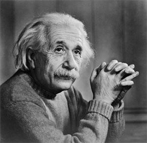
The image that I am going to chose from the Karsh exhibition at the Winnipeg Art Museum is his photo of Albert Einstein from 1948. I was trying to choose between this photo and his photo of Muhammad Ali which was shot in 1970. I had a hard time choosing between all the wonderful images, but decided came down to his photo of Ali and his photo of Einstein, I ended up choosing Einstein, because the darkroom techniques are more apparent (to me). I can't believe how great the lighting is in this photo and almost everyone of his photos. Obviously he is doing some darkroom manipulation, but he obviously still had fantastic lighting to begin.

The technical aspects of this image are all spot on. There are really no compositional or technical suggestions that I could give that would make this photo any stronger. It is probably as close to a "Perfect Image" as any photo you will ever see. The compositional elements of this subject are amazing, the eyes have perfect placement and focus, the positioning of the hands and of course the lighting. The image's contrast looks incredible, obviously some selective contrast/burning/dodging has been applied to give it that perfect contrast, on top of excellent lighting to begin with of course. If I were to comment on specific darkroom techniques he did on this image I would firstly look at the eyes, they are clearly darker/more contrast than the rest of the image, which brings me to believe he burned the eyes in for a long time in the darkroom, he may have also added split contrast in the eyes. The other areas that stand out to me are the hands, they are very contrasty and most likely have burning in the shadowed areas. There is an area around his left arm that appears less contrasty and a little brighter than the rest of the image, I would imagine he either did less processing/burning around this area or perhaps dodged it. The background to me looks like the most obvious area that was burned (other than the eye pupils) it is clearly much darker and helps bring attention to the brighter face. I would imagine Yousuf Karsh attempted many different things in the darkroom to give him that "look" he has in most of his images.
I would be curious to see what the original negative looked printed without any processing, just for my own curiosity.

Here is the image I am referencing


Large (600PX):
http://ffden-2.phys.uaf.edu/211_fall2004.web.dir/George_Walker/Albert_Einstein_by_Yousuf_Karsh.jpg

Friday, November 27, 2009

Colour Block

This is an assignment for creative imaging. We first chose four colours from: Magenta/pink, Cyan, Green, Blue, Violet, Red, Orange, and Yellow. The four colours I ended up choosing for this assignment were Yellow, Green, Blue, and Red. The next part of this assignment was to make or create two more images: one that featured a similarity between colours, and one featuring complimentary colours.

For my Green image I used a picture of grass, which is obviously Green. I think picking green grass was a good choice since everyone knows grass is generally green. I filled the frame mostly with the green grass, there were a few areas of the frame with leaves etc, but not enough to take away from the greens. I think the feeling I get from this image, as well as other images of green things is vegetation, and freshness. Considering green is often the color of fresh foods/etc and of course people use the term "Fresh Greens" when referring to fresh vegetables.

For my image of Red, I took a photo of a fire hydrant. It is obviously red, and they are usually red in most areas of the city. I enjoyed this image the best out of my reds images, because of the different elements, when I filled the frame with only red it was boring. I also cropped out some parts to draw attention to the reds. When I view this image I can see why they use red for fire hydrants, as the colour red draws so much attention to people's eyes.

For my Yellow image I shot a photo of my friends yellow shirt. I decided to include part of his face, because I think a picture of just a yellow shirt would be a little bit boring. When I look at this image I think the yellow shirt really stands out, as it did in real life. I actually saw his shirt and thought of this assignment, so that shows how strong of a colour yellow is. When I think of yellow I think of happy/cheerful, I certainly don't feel depressed when looking at it. I think most people feel happy when looking at yellows, I even heard that they had to paint over yellow walls inside of an office, because the employee's spent most of the time staring at the yellow. I also think the fact that he is smiling helps the image, and show it's relation.

For my blue image, I took a picture of the sky, because obviously the sky is blue, most of the time. Luckily the sky was fairly blue, it did have some clouds, which do cover up some of the blue, but I think they help the image overall. I included a bit of a tree for interest. When I look at this image I would say it feels lonely, the blue sky and clouds, with the small portion of tree gives it a lonely feeling.

For my Complimentary/opposite colours I chose to do blue and red, which aren't opposites exactly on the colour wheel, but I feel they are different enough, and also help for the image which deals with opposites. I think the colors are different enough for this image, and the fact that I am using both coke and Pepsi which are known opposites helps, I would imagine.

For my similar colors I used some of my mom's nail polish, and I used a bright pink in the background with a red coloured one in the foreground. I used my macro lens and focussed on the front(red) one. I used a flash to light this image, and reflected it to illuminate both sides.

That's all. Here are the images in a slideshow:

Friday, October 30, 2009

Zoo field trip

Here are some photos from our Creative Imaging field trip to the zoo. It was cold which made it kind of hard to shoot. At one point I think I kind of got lost.. well not really, but I was walking around parts of the zoo that I haven't seen before. Overall it was a fun experience, and probably would have been more fun if I hadn't just gone for another assignment last week.

Here is a slideshow

Friday, October 23, 2009

AT: 6.2 Photographic Hero.

My photographer that I chose for this assignment was Eddie Adams. I was able to find a series of his images on the internet. And I was able to come to some conclusions based on them, as well as the many readings based on him. He is one of the most honored and published photographer's of our time. From looking at his images, it is quite clear that his early works are in black and white film, this is apparent, because of the dates the images are taken. It seems as though his later works he did more color, but a large portion of his early work from the 1960's/70's is in Black and white film. His most famous image is on black and white film, it's the image he won the Pulitzer Prize in 1969, which was his unforgettable photograph from Vietcong.

The format he uses seems to vary, most of his Black and White images are of different shapes/formats they are not all one size/shape (example: square, 5x7, 4x6). This makes it hard to tell what type of camera he uses since I was not able to see specific information regarding his camera equipment, so I am unsure. I would assume he's using many different types of cameras though, probably since he has many different photos at so many locations. He has photos dating back to the 1950's so it is fair to assume that he has had many cameras. It also appears as if he's not just using one single format/camera type. I would assume he used different cameras for different jobs, considering he has photos from Vietnam during the war, I would assume that he's not lugging around a large format camera, and would naturally assume he's using a 35mm camera or even a smaller Medium Format camera. But as I haven't been able to find specific information on his camera types I don't know for sure. It looks as though he also used many lenses and this may hint at what Format he is using, if the photo has a shallow depth of field, than it may be fair to assume that he's using a larger format camera. This image for example:

1. Image link: Here

1. My personal opinions on this photo: Well obviously this photo tells a story. It is a very strong image, it has a perfect composition, Focus, contrast, everything technical is pretty much perfect. It has tons of emotion in it as well, the depth of field helps focus on the main subject, the persons body positioning tells so much, as well as their attire. This photo is of an Israeli soldier in the Suez Canal in 1973. I think it is a very strong image.


2. Image Link: Here


2. This image I enjoy, and maybe it's because of the subject matter as I am an avid boxing fan myself, but I feel it portrays Muhammad Ali quite well in his facial expressions. he was known as being a very confident boxer and is known world wide for his personality, I feel this photo shows him off as well as any photo could. The photo from a technical stand point is also very good. It's sharp, lit well, and composed nicely. I also like that the eyes are lit up perfectly, and how they are framed in between his hat and glasses.


3. Image Link: Here


3. This image is of a coal miner in West Virginia in 1969. It's a very strong image in my opinion, the contrast between him and the background/surroundings really helps bring attention to the main subjects. The tracks act as leading lines. The facial expression and body positioning are also important to the image as they portray a certain mood.


Thursday, October 8, 2009

Creative Imaging: Composition at home

For this assignment we took photos in our homes and using design elements to help improve our compositions. The design elements were, Line, Shape or form (I chose form), Pattern or Rhythm (I chose to do pattern), Texture, Symmetrical balance, and Depth.

I found this to be an interesting assignment. I did find some harder than others, but mostly I was able to find enough objects in or around my house to photograph that wold fit the assignment outline. The hardest for me was probably depth, because I had a hard time picking a photo/subject for this. I think I probably did texture the best, as to how it related to the description, I also felt my photo for form was a good example of form going by the description.

Line:

Monday, October 5, 2009

Unit 1 practical quiz-slide show

here is my slideshow. 10 Portraits with Sheldean.

Wednesday, September 30, 2009

Creative Imaging: 3 things 100 different ways

This was a creative imaging assignment that we did last week on Friday afternoon. You had to shoot 100 pictures of only 3 things in creative ways. I chose tooth pics, a cell phone, and my laptop. They don't really have anything in common with one another, but I felt I got some interesting photos regardless. I decided to use a macro lens, as it just seemed like it would be the best for this sort of assignment, I think I was right. I tried using a wider lens, but that just didn't work quite as well, especially for the up close detail shots. The macro lens provided a shallow depth of field on my images which for some of them I felt really made them more interesting, although for others it might not have worked out so well. I tried to take as many different views of the subjects as possible, hoping I didn't do the same thing over and over. I got better images than I anticipated, some did not turn out so well, but others turned out quite nicely I think.


Sunday, September 20, 2009

Lines assignment: DT 2.1


Lines


I found it hard to find interesting subjects to shoot with the theme of "lines" a large amount of the photos turned out fairly boring. I went walking around the exchange district with a wide angle lens and took pictures of various lines on buildings. I found a fair bit of them to be uninteresting, I decided when I got home I would use my macro lens to find some interesting lines. I liked my macro photos better, I took pictures mostly of my laptop and lined paper.

Monday, September 14, 2009

DT1.1 Picture


What is your favourite genre of photography?

My favourite genre of photography is probably Landscape photography, I also enjoy macro and others, but my best stuff is landscape.

What do you hope to learn in school this year?
I hope learn about film techniques, Film processing/Dark room techniques, and the business aspects of being a photographer.

What is your best photography-related memory?
Probably my first trip to Mexico with my old Nikon D50 about 2.5 years ago. I was just starting to get serious about photography and shot better photos from that trip than I had before.

First post

First post